
Transition Discoveries - Exploring strategies and opportunities to boost website usability for young adults with disabilities
Role
UX Researcher
UX Designer
UI Designer
Timeline
18 Weeks
Project Type
Edtech
Team
4 Product Designers
INDIANA UNIVERSITY CAPSTONE 2024 "BEST PROJECT IN SHOW" AWARD

Transition Discoveries is a nonprofit focused on aiding youth with disabilities in transitioning from high school to further education and employment. They aim to build an accessible platform offering tailored resources and support for youth, families, and professionals.
Context
Challenges
What obstacle is Transition Discoveries currently facing?

Youth with disabilities (13 - 20 years old)
who are transitioning from high school to higher education or work.

Enhance the website that offer clear, navigable, and engaging content

Address the unique needs of each user so that users feel supported and confident in their educational and career progression
"How might we ensure that the platform becomes a catalyst for a confident and supported transition experience for youth with disabilities?”
Approach
How did we transform user needs into an effective solution?
4 weeks
Prelimnary
2 weeks
Generative
2 weeks
Evaluation
2 weeks
Strategy
6 weeks
Build
-
Literature review
-
Competitive analysis
-
Survey
-
Focus Group Study
-
Expert Interviews
-
Cognitive
-
Heuristic
-
Thematic
-
Archetypes
-
Painpoints
-
Ideation
-
Low fidelity
-
Hi-fidelity
Final Design
Tackling the challenges through design
1
Pinpoint
The current homepage has a cluttered layout and overlapping visual elements which is straining for users with varied disabilities, leading to a decreased conversion rate
Solution
-
I simplified the homepage only to show important information, and to quickly communicate the value proposition to users, enhancing user engagement.
-
I added a call to action button (CTA) that leads users to access content directly to a signup page, streamlining the decision-making process and increasing the conversion rate.
Before

Introduced call to action button to increase conversion rates as it simplifies the user's decision-making process.
Integrated an AI chatbot for website assistance.
Moved and transformed the 'community impact' section to a 'why choose us' section at the top to quickly convey to users what the website offers.
Expanded social happenings by prominently featuring event images to foster community building.
After

2
Pinpoint
The layout of the discovery board is complex and inconsistent, which complicates navigation to access modules for youth with disabilities. It also lacks elements that engage users.
Solution
-
Improved typography and visual elements for consistency & hierarchy, making it less straining when it comes to readability.
-
Structured information based on functionality for clarity & intuitiveness.
-
Added features like Goals, Badges, and forums for motivation, making it more engaging.
Before

After
Revamped the journal and job summary sections to include illustrations, making them more visually appealing, and increasing interaction with the content.

Placed earned badges, coin collection, and the accessory store prominently at the top rather than in separate sections. Also introduced a "today's goal" feature to boost motivation.
Reformatted the adventure section modules into card layouts that concisely display a progress bar and a certificate download option, thus decreasing the number of clicks required.
3
Pinpoint
Clients were seeking AI-driven motivational features. Additionally, a feature to foster collaboration among peers and mentors.
Solution
-
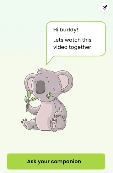
Leveraging conversational AI as a companion for enhancing learning and engagement that accompany users throughout their journey of completing modules on the platform.
-
Implemented a floating note for noting information from the modules, enhancing the personalized learning experience.
-
Introduced a forum for students under the same mentors to share experiences, and knowledge, and clarify doubts which is facilitated by mentors.


Included a Floating Note board for quick information typing or recording.
Client's request to foster collaboration among peers and mentors, a collaborative platform is proposed for students under same mentors to share experiences, knowledge, and clarify doubts
Teaching-Oriented AI Chatbot
Assists by summarizing videos with key takeaways, offering real-life application examples, defining difficult words, and providing quizzes.
Accelerated workflows by 1.5x and boosted overall satisfaction by about 53%.


Let's trace the route to the solution
HEURISTIC EVALUATION
Identified key usability issues and suggested improvements aligned with Nielsen's 10 usability heuristics.
1
Unstandardized and inconsistent website button design
-
Heuristic broken: Match between system and the real world and consistency and standard
-
Severity ranking: 4 (Usability catastrophe)
-
Possible solution: Elements that follow industry standards and the users can understand without the click here prompt.

2
The website's layout and information display are designed inconsistently.
-
Heuristic broken: Consistency and standard
-
Severity ranking: 4 (Usability catastrophe)
-
Possible solution: The layout of the website needs to be redesigned using industry standards. All the graphical elements of the UI need to be uniform and aligned appropriately.

3
Two searches have the same functionality and an increased number of clicks.
-
Heuristic broken: Aesthetic and minimalist design
-
Severity ranking: 3 (Major usability issue)
-
Possible solution: One of the buttons can be removed and minimal design.

4
Task/Video Completion Error
-
Heuristic broken: Help and documentation
-
Severity ranking: 3 (Major usability issue)
-
Possible solution: Refine the algorithm to distinguish between skipped and genuinely completed views, ensuring accurate user engagement tracking.

Evaluative Research
THINK ALOUD SESSIONS
Measuring effectiveness and efficiency metrics to evaluate the performance of the website.
6 participants
Performed a cognitive walkthrough involving six young participants with disabilities.
5 tasks
Participants were asked to perform 5 tasks and then respond to follow-up questions.
2 usability metrics
Converted the collected data into quantitative metrics using the following measures.
Background
Preliminary Research
Literature Review
What are the crucial support mechanisms necessary, or potential areas of shortcomings while designing for youth with disabilities?
Need for more learning opportunities and accessible resources and the adaptation of eLearning content to diverse needs.
The Universal Design for Learning guidelines emphasize tailored to meet each learner's unique needs.
Focus on large, contrasting fonts, non-flashing visuals, user-friendly controls, and transcript availability for multimedia.
The importance of students participating in self-assessment, encouraging them to monitor their progress.
MARKET ANALYSIS
Are there other emerging technologies that we can leverage to enhance our platform?

Usability
1
Include interactive lessons, videos, role-play scenarios, and supplementary activities tailored for students with disabilities,
2
Tailors the learning experience to each student's unique needs and understanding.
3
Leverages the power of AI to make real-time feedback about what content to present to students, based on their past performance and current needs.
Accessibility
EMPATHIZE
Generative Research
USER SURVEY
What resources are available for youth with disabilities and what challenges do they face in using them?
Key supports include accessible online resources, adaptive technology, mentorship, and involvement in clubs, communities, and workshops. Regular guidance from disability services. The role of personal resilience, therapy, vocational training, and online community engagement also stands out. This highlights the diverse needs and approaches in their transition journey.
62.5 %
62.5 %
had difficulty accessing or finding the resources.
56.3 %
utilized mentors or support networks, barriers in accessing.
73.3 %
utilized mentors or support networks, although there were barriers in accessing resources.
FOCUS GROUP STUDY
Conducted focus group with current users and novice users to gain deeper understanding of the website’s usability and features.
10+ Participants
current users with disabilities.
5 Participants
novice users with disabilities.
1
Streamlining the user account setup and data collection process by minimizing required personal data and enhancing transparency about data use.
1
Necessity of specialized counseling for students with non-traditional qualifications and trauma-informed resources.
2
Navigational difficulties, particularly for new users, need addressing through more intuitive interface design and clearer labeling.
2
Development of inclusive, accessible online learning platforms and tailored support programs, like scholarships for students is crucial
3
Optimizing information presentation is crucial, balancing text and visuals for clarity and incorporating diverse, inclusive media content.
3
Empowerment through robust family and peer support networks, community engagement, and mentorship is essential for personal growth.
4
Interactive elements like avatars need personalization, and structured guidance for various features is essential to improve.
4
Include personalization, interactive elements, and flexible content navigation is vital, along with ensuring aesthetic appeal and inclusivity.
EXPERT INTERVIEW
Conducted interviews with experts to gain insights on designing accessible and inclusive design.
2 Professors
30+ experience in field of assistive technology and 15+ experience in field of special education.
1
Feature clear language, adjustable reading levels, and offer social/emotional support through self-paced learning.
4
Essential is thorough WCAG accessibility testing and improving auto-translate captions for inclusivity.
2
The collaborative tool highlights the importance of communication and resource sharing among youth, professionals, and support networks.
5
Guided instruction is vital for effective interaction with the website's material.
3
Integrating universal design principles, offering differentiated content, and balancing engagement with gamification is crucial.
Analaysis + Sythesis
Strategy
THEMATIC ANALYSIS
Grouped insights and related ideas to unveil underlying pain points and priorities.
High Priority
Design and Usability Issues
Design needs
Low Priority
Content Personalization
Learning Needs
E- learning resources &
technology use
Accessibility and Inclusivity
Support System
Transitional Challenges
To be considered
Potential Solutions
Outcomes
PAINPOINTS
Key pain points discovered...
1
Inconsistent Design, Complex Navigation, and Varied Aesthetics.
4
An unbalanced text and visual content mix leads to readability and information overloading issues.
2
Lack of standardized designs in interactive components, leading to increased time taken.
5
Insufficient mentor, parent, and community network support.
3
Lack of motivational and interactive features to sustain user engagement and learning.
6
Need for tailored assistance and customizable interfaces for youth with different challenges.
Build
Ideating on the Solutions
1
Improving the website's usability and visual appeal by refining colors, typography, and layout, aligned with their brand identity to declutter the interface.
2
Leveraging conversational AI as companions to boost learning and engagement, guiding users interactively as they complete each module on the platform.
3
Additionally, offering interactive learning cards, progress bars, a notes board, situational quizzes, and a collaborative platform.

Implementation
A glimpse of how we iterated and implemented changes based on concept validation and feedback.
1
Revamped the website
Improved the website's usability and visual appeal by refining colors, typography, and layout, aligned with their brand identity to declutter the interface.
In the initial phase, we applied all our concepts in a basic, low-fidelity format to validate the ideas and gather feedback from clients.
Clients loved redesign but worried about confusion among users due to recent brand launch. They were perticual that we stick to visual appeal that matched their brand identity.
In the end, we successfully delivered meticulously organized content, resulting in a decluttered and user-friendly homepage.


2
Streamlined the onboarding screens
The onboarding process has been streamlined into three distinct parts, with information presented in a two-column layout to minimize scrolling. A progress bar has been added to keep users informed about their onboarding status. Additional text has been provided to clarify the purpose of data input.

In the initial phase, we ideated on the ways to make onboarding simpler. On client approval, we decided to categorize into 3 sections and a progress bar
We successfully delivered meticulously organized content, resulting in a decluttered and user-friendly homepage.

3
Introduced AI chatbot
Leveraged conversational AI into an existing companion element to boost learning and engagement, guiding users interactively as they complete each module on the platform.


After considering various options, we ultimately chose to transform their existing companion into an AI-powered conversational chatbot.

After transforming into high-fidelity, we received user feedback indicating that the text size was too small, causing cognitive strain."

Then taking the user feedback into consideration, we increased the the size of the box and font to make it more legible.

MY LEARNINGS AND TAKEAWAYS
How has this experience contributed to my growth?

Finding common ground with client
Making informed decisions is crucial, particularly when trying to find common ground with clients. To achieve this, I ensure that every decision is backed by solid research and aligns with the client's goals and the project's requirements.

The value of biweekly meetings
Biweekly meetings have been instrumental in keeping my projects on track. These regular check-ins serve as a platform to provide updates and receive feedback, ensuring that the project progresses consistently.

Effective cross-functional communication
Working with cross-functional teams has taught me the importance of clear and effective communication, especially regarding the feasibility and implementation of projects.

Upholding the brand identity
It is vital to respect and incorporate the client's brand identity in the redesign. Unless tasked with a complete rebranding, integrating their established brand elements into the project.